CSS-flex
2018-05-28 12:11:13 黄卉 css通过css3中的flex布局,实现一个流式布局:每行的项目数固定为4个块,然后会自动进行分行。分两种情况:一种有左右间距,一种没有。
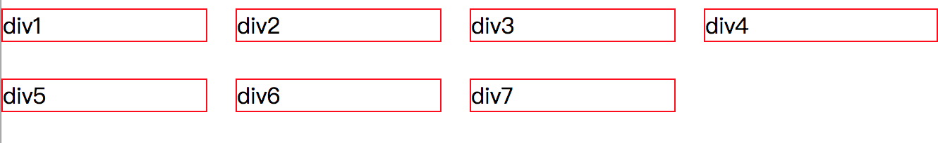
1、左右有间距的效果
-
效果
-
代码
<!DOCTYPE html> <html> <head> <meta charset="UTF-8"> <title>flex-flow</title> <style> *{margin: 0;padding: 0} .outer{ display: flex; flex-flow: row wrap; } .outer .block{ box-sizing: border-box; flex: 0 0 25%; height: 50px; padding: 10px 20px 10px 0; } .outer .block:nth-child(4n){ padding-right: 0 } .outer span{ box-sizing: border-box; display: inline-block; width: 100%; border: 1px solid red; } </style> </head> <body> <div class="outer"> <div class="block"><span>div1</span></div> <div class="block"><span>div2</span></div> <div class="block"><span>div3</span></div> <div class="block"><span>div4</span></div> <div class="block"><span>div5</span></div> <div class="block"><span>div6</span></div> <div class="block"><span>div7</span></div> </div> </body> </html> -
【实例】
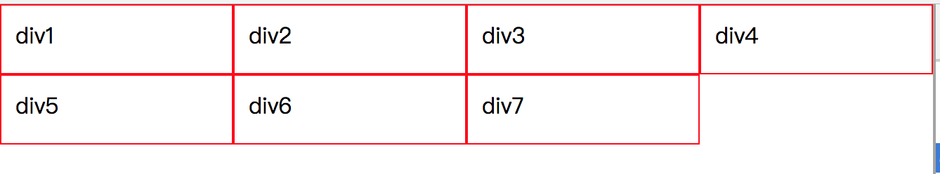
2、左右没有间距
-
效果
-
代码
<!DOCTYPE html> <html> <head> <meta charset="UTF-8"> <title>flex</title> <style> *{margin: 0;padding: 0} .outer{ display: flex; flex-flow: row wrap; } .outer div{ box-sizing: border-box; flex: 0 0 25%; height: 50px; border: 1px solid red; padding:10px; } </style> </head> <body> <div class="outer"> <div>div1</div> <div>div2</div> <div>div3</div> <div>div4</div> <div>div5</div> <div>div6</div> <div>div7</div> </div> </body> </html> -
【实例】
以上文章来自:黄卉 , https://huanghui8030.github.io/css/flex.html
CSS(15)
- CSS-flex 2018-05-28
- CSS-layout 2018-05-11
- CSS-position 2018-05-10
- CSS-display 2018-05-10
- CSS-span 2018-05-09
- CSS基础知识汇总 2018-03-04
- div水平垂直居中 2018-03-03
- 盒模型:W3C盒模型和IE盒子 2018-03-01
- block, inline和inline-block的区别 2018-03-01
- css3中content特殊字符列表 2017-10-10
- 纯CSS美化radio/checkbox样式(兼容IE9+) 2017-10-10
- 文本省略显示 2017-10-09
- 去掉按钮点击后的虚线框样式 2017-10-09
- 基础样式_base.less 2017-02-08
- less课题研究 2017-02-08
Html(4)
JQuery(9)
- holidayCalendar休息日设置日历插件 2017-10-13
- fullCalender日历插件 2017-10-12
- jquery zoom 图片放大镜效果插件 2017-10-11
- bootstrap在线生成布局插件 2017-02-08
- jQuery-Validation插件用法总结 2016-07-20
- fullpage全屏滚动 2016-07-13
- MoveJs实现动画效果 2016-07-12
- json格式解析以及jsonp返回方法解析跨越问题 2016-07-11
- 基于jquery的插件 2013-02-07
Js(29)
- Array之判断数组相等 2018-07-08
- Array之reduce应用 2018-05-28
- ES6之变量的解构赋值 2018-05-23
- ES6之变量let、const的特点总结 2018-05-17
- js中Array和String对象的方法总结 2018-05-17
- 前端模块化理解 2018-05-15
- js中经常遇到的一些基本算法 2018-05-11
- web前端安全 2018-03-16
- http与https的概念和区别 2018-03-10
- 移动端浏览器使用分析(2018年2月) 2018-02-10
- 组件库layui的说明 2018-02-09
- 现代富文本编辑器 Quill 2018-02-06
- 09、Promise用法 2017-12-30
- 08、12种不宜使用的JavaScript语法 2017-12-30
- 07、JS闭包 2017-12-29
- 06、JS继承的方式 2017-12-18
- 05、JS原型链 2017-12-17
- 04、JS常见的四种设计模式 2017-12-06
- 03、call、apply和bind 2017-12-05
- 02、ES5中函数的4种调用和ES6中函数的调用 2017-11-10
- 01、函数的3种定义方法 2017-11-10
- 复制文件插件clipboard用法-不依赖flash 2017-10-18
- 原生js实现Date格式转化 2017-10-18
- D3数据可视化工具 2017-04-27
- 数据可视化工具研究 2017-03-29
- Yahoo军规-前端优化14条 2016-07-21
- 【微信】分享到微信时,页面的图片和描述 2016-07-13
- JavaScript事件总结 2016-07-09
- 原生js小游戏 2013-02-07
Webpack(11)
- 十、webpack3.x之实际应用 2018-01-12
- 九、webpack3.x之其他配置 2018-01-11
- 八、webpack3.x之plugins配置 2018-01-10
- 七、webpack3.x之loader配置 2017-12-17
- 六、webpack3.x之entry&output配置 2017-12-16
- 五、webpack3.x之配置文件 2017-12-15
- 四、webpack之命令行 2017-12-14
- 三、webpack之css文件处理 2017-12-12
- 二、webpack之简单打包 2017-12-11
- 一、webpack简介 2017-07-26
- webpack3.x课题研究 2017-02-08
Mocha(6)
- 五、Mocha单元测命令行之基本用法 2017-08-11
- 四、Mocha单元测试断言库 2017-08-10
- 三、Mocha单元测试基本用法 2017-08-09
- 二、Mocha单元测试大致流程 2017-08-09
- 一、Mocha单元测试框架介绍 2017-08-08
- 单元测试框架Mocha 2017-08-07
Node(19)
- Nodejs服务器挂掉后自动重启方法 2018-02-08
- express-session resave saveUninitialized 解释 2018-01-28
- Nodejs删除文件夹或者是指定文件 2018-01-23
- 找出所有的大于100KB的图片 2017-12-11
- nvm 管理不同版本的 node 与 npm 2017-11-10
- express框架中ejs模板的基本使用 2017-11-07
- NodeJs中通过express框架ajax获取参数的方法 2017-11-07
- NodeJs中通过express框架实现登录状态保持的方法 2017-11-06
- NodeJs中express的用法 2017-11-05
- NodeJs设置cookie方法 2017-11-04
- nodeJS通过execSync方法执行svn log时乱码问题的解决 2017-11-03
- nodeJS获取ip地址(服务器端和客服端) 2017-11-02
- nodeJS链接本地mysql数据库,实现数据查找功能 2017-11-01
- nodeJS获取svn记录信息(svn log命令行) 2017-10-31
- nodeJS获取svn记录信息(svn-info插件) 2017-10-31
- NodeJs读取文件 2017-10-30
- nodeJS启动服务,并完成数据的增删查改,数据存在json文件中 2017-10-26
- nodejs版本升级 2017-10-26
- loadsh是什么 2017-07-10
Mysql(5)
- mysql数据库通过ip地址访问 2017-10-31
- mysql数据库无法插入中文 2017-10-30
- mysql数据库命令行访问 2017-10-29
- mysql增删查改等语句 2017-10-28
- mysql数据类型 2017-10-26
其他(6)
- 自己的开源项目-gulp插件 2018-04-30
- 课题研究PPT 2018-04-14
- 个人日程及任务管理经验分享 2017-03-24
- 前端知识汇总 2017-02-10
- 收藏夹 2017-01-18
- 前端开发规范总结 2016-07-29
工具(11)
- Jekyll用法 2018-06-19
- Sublime text3中运行Nodejs 2018-01-23
- npm 命令行操作 2017-12-06
- linux 命令行操作 2017-11-06
- 淘宝镜像cnpm替代npm的方法 2017-11-03
- svn 命令行常用方法 2017-11-01
- koala软件-实现js和css的自动压缩 2016-08-04
- Brackets编辑器用法总结 2016-07-18
- 【插件】Browsersyns插件用法 2016-07-17
- Sublime Text用法 2016-07-11
- github命令 2016-07-10